Building cross-browser focus indicators
Published Sat Jan 07 2023 13:00:00 GMT+0000 (Coordinated Universal Time)
Tech
What are focus indicators
When using an app, at any given time, a single interactive element can have focus. Once an element has focus, the user can interact with it in a number of ways. For example, when a text input has focus, typing will insert text into that field.Users of assistive technology and power-users rely on this focus more than typical users — and it’s important for them to know which element is currently focused. A typical user might simply place their finger or cursor over a button they wish to press, but someone using only a keyboard would need to focus that button, and then perform an action to activate it. If they can't easily determine where the focus is, they will struggle to use the site.
Why build your own
Browsers are yet to standardise focus indicator appearance. If a user visits the same website in 3 different browsers, they will see different browser focus indicators in each.
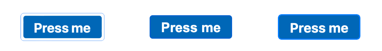
Even if we override the style with CSS, the outcome won’t always be the same. Here we've applied outline: rgba(0, 125, 250, 0.6) solid 2px.


Building our own custom focus indicators allows us to be in control, and deliver a consistent, accessible, on-brand experience across all browsers.
You can see great examples of custom focus indicators on gov.uk
How to make my focus indicators
I started by identifying the behaviour I wanted- When an element has focus, a blue focus indicator is shown around it
- The focus indicator is offset by a few pixels to ensure it’s easily visible even if the focus colour is similar to the element colour.
- The indicator should only show for thefocus psuedo-class, and not others such as hover, active, visited, etc.*

I wanted to ensure this styling is easily applicable to multiple components and avoid duplication. I wrote a styled-css helper. You could implement something similar as a Sass mixin.
const outlineColor = 'rgba(0, 125, 250, 0.6)';
const outlineColorDarkMode = 'rgba(0, 125, 250, 0.6)';
const outlineGap = '0.35rem';
const outlineWidth = '0.2rem';
const outlineBorderRadius = '0.5rem';
export const focusStyle = () => css`
  &:focus-within,
  &:focus {
    /* stylelint-disable-next-line declaration-no-important */
    outline: none !important;
    &::after {
      position: absolute;
      /* Could just use "inset" but it's not widely supported */
      top: -${outlineGap};
      right: -${outlineGap};
      bottom: -${outlineGap};
      left: -${outlineGap};
      content: '';
      display: block;
      border: solid ${outlineColor} ${outlineWidth};
      border-radius: ${outlineBorderRadius};
      pointer-events: none;
      @media (prefers-color-scheme: dark) {
        border-color: ${outlineColorDarkMode};
      }
    }
  }
`;
javascriptCopyright
Most of my photos are licensed under Creative Commons BY-SA 3.0.If you are unsure about your right to use them please contact me.