CSS pixels are a lie
Published Sat Dec 26 2020 21:30:00 GMT+0000 (Coordinated Universal Time)
Tech
Over the years, our screens have become more and more densely populated with pixels. Modern displays are often described as 2x or 3x meaning they have 2² or 3² times as many pixels as a traditional display of the same physical size.
As a result, if developers specify dimensions in their apps using pixels (px), everything would look too small on newer devices - or too big on old devices.
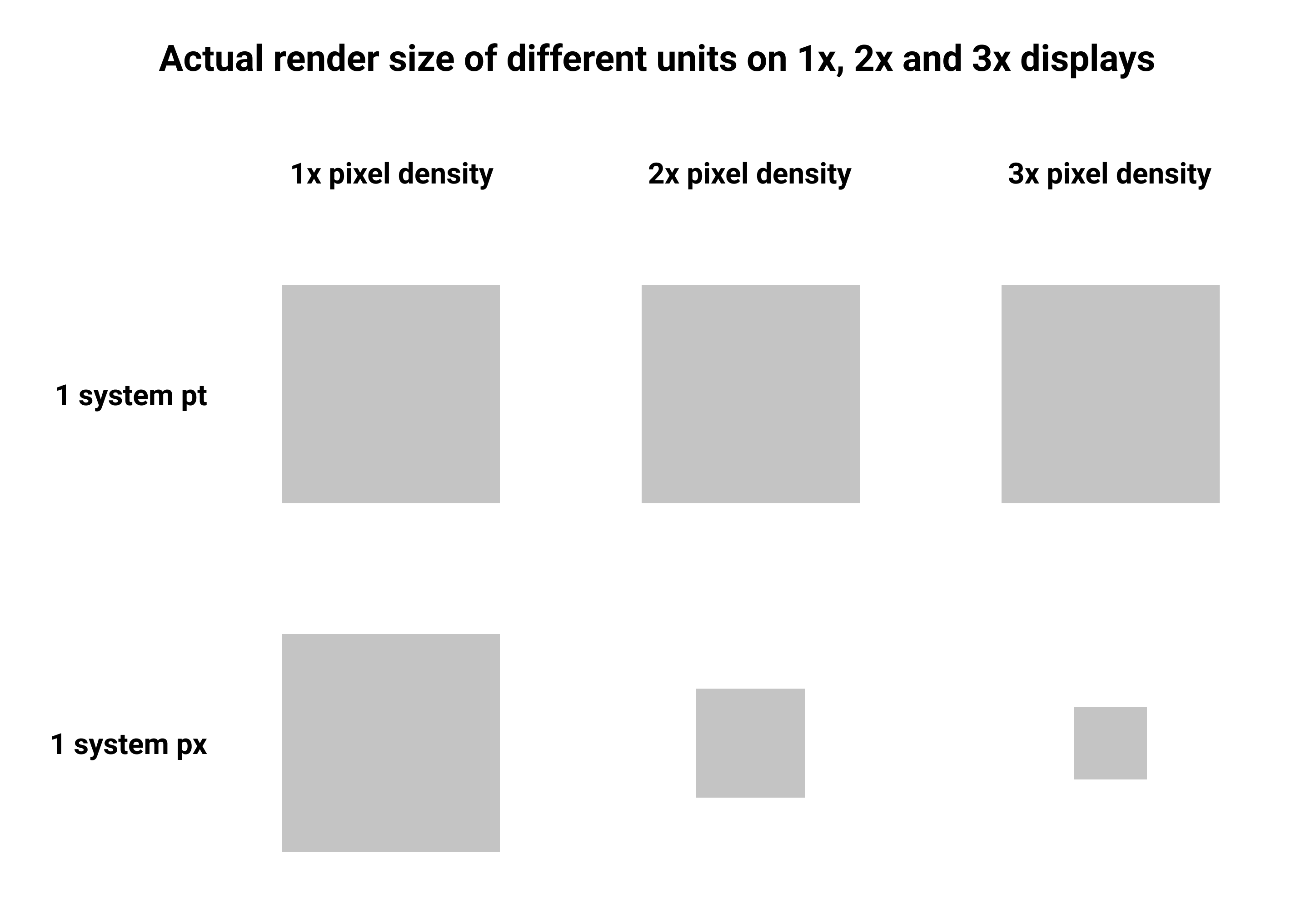
To counter this, operating systems often provide an abstraction of pixels. For example the point (pt). This way developers can specify the size of an element in a display-agnostic way. On an older device, 1 point might be 1 physical pixel - and on a newer device 1 point could be 36 physical pixels.
The following image shows the relative physical size that each system unit would be displayed on a 1x, 2x and 3x device:
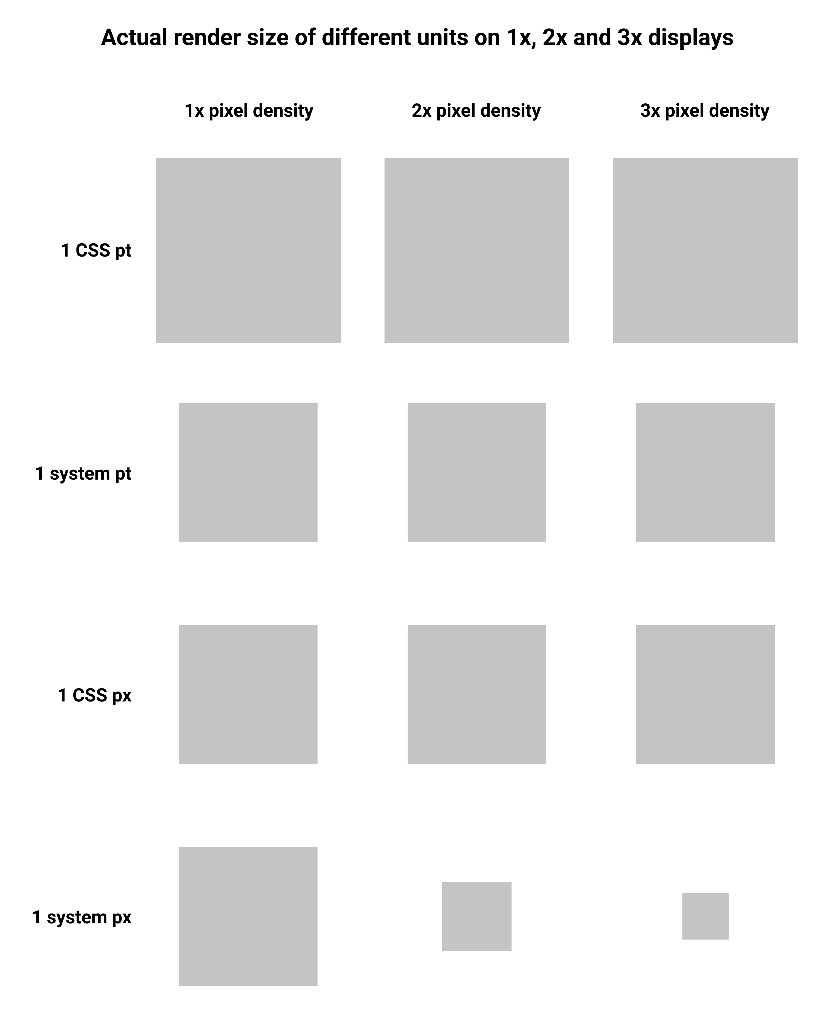
So instead, CSS mapped 1 of its "CSS pixels" to 1 system point, and defined one "CSS point" as 1/0.75 system point. Doing this ensured that things remained the same relative size even if specified in a mixture of points and pixels or shown on higher DPI displays. The downside of this approach is that web developers are no longer able to control the size of something in actual device pixels, as they only have point-based abstractions available.
The following image shows the relative physical size that each system and web unit would be displayed on a 1x, 2x and 3x device:
As a result, if developers specify dimensions in their apps using pixels (px), everything would look too small on newer devices - or too big on old devices.
To counter this, operating systems often provide an abstraction of pixels. For example the point (pt). This way developers can specify the size of an element in a display-agnostic way. On an older device, 1 point might be 1 physical pixel - and on a newer device 1 point could be 36 physical pixels.
The following image shows the relative physical size that each system unit would be displayed on a 1x, 2x and 3x device:
CSS pixels
CSS could have just rolled with the same system that operating systems provided, but too much existing web content already relied on the assumption that every device had 96 dots-per-inch (DPI). Developers were used to specifying things in pixels, or worse a mixture of pixels and other units. As a result, lots of existing websites were becoming horribly broken on modern devices.So instead, CSS mapped 1 of its "CSS pixels" to 1 system point, and defined one "CSS point" as 1/0.75 system point. Doing this ensured that things remained the same relative size even if specified in a mixture of points and pixels or shown on higher DPI displays. The downside of this approach is that web developers are no longer able to control the size of something in actual device pixels, as they only have point-based abstractions available.
The following image shows the relative physical size that each system and web unit would be displayed on a 1x, 2x and 3x device:
Conversions
This table gives an idea of how values translate between CSS pixels, actual pixels and points.| Screen density | CSS points | System points | CSS pixels | System pixels |
|---|---|---|---|---|
| 1x | 90 | 120 | 120 | 120 |
| 2x | 90 | 120 | 120 | 240 |
| 3x | 90 | 120 | 120 | 360 |
Copyright
Most of my photos are licensed under Creative Commons BY-SA 3.0.If you are unsure about your right to use them please contact me.