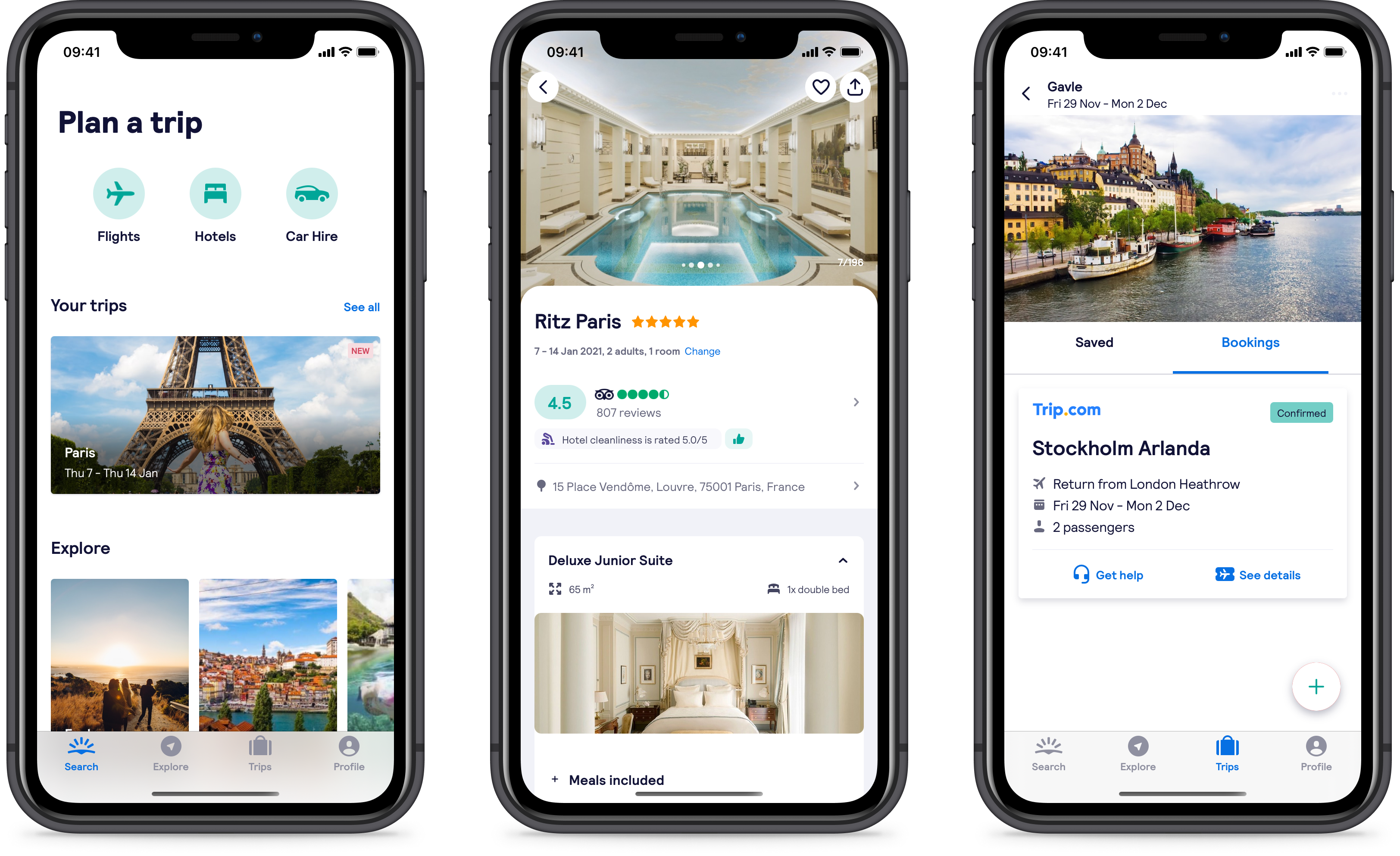
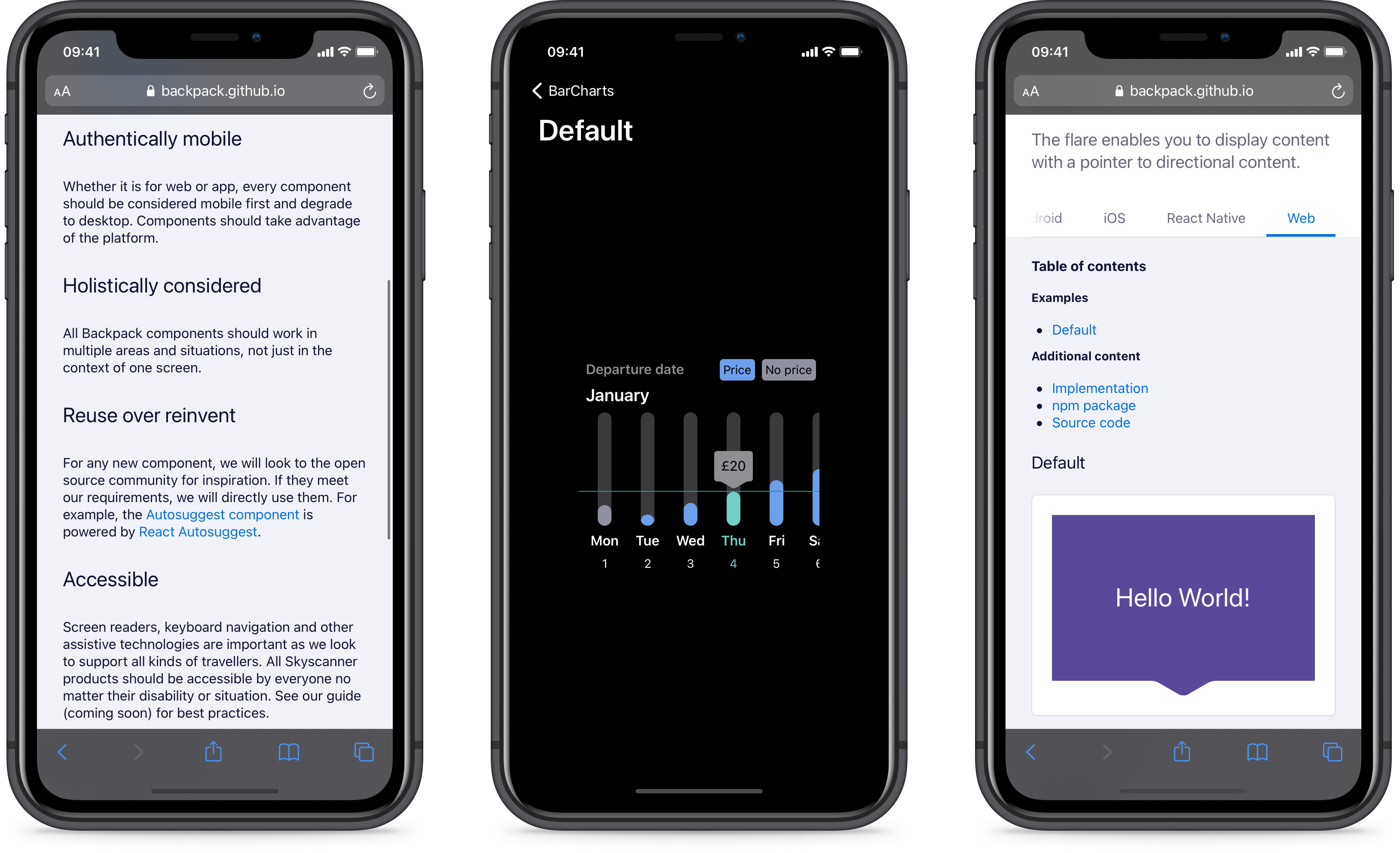
Backpack

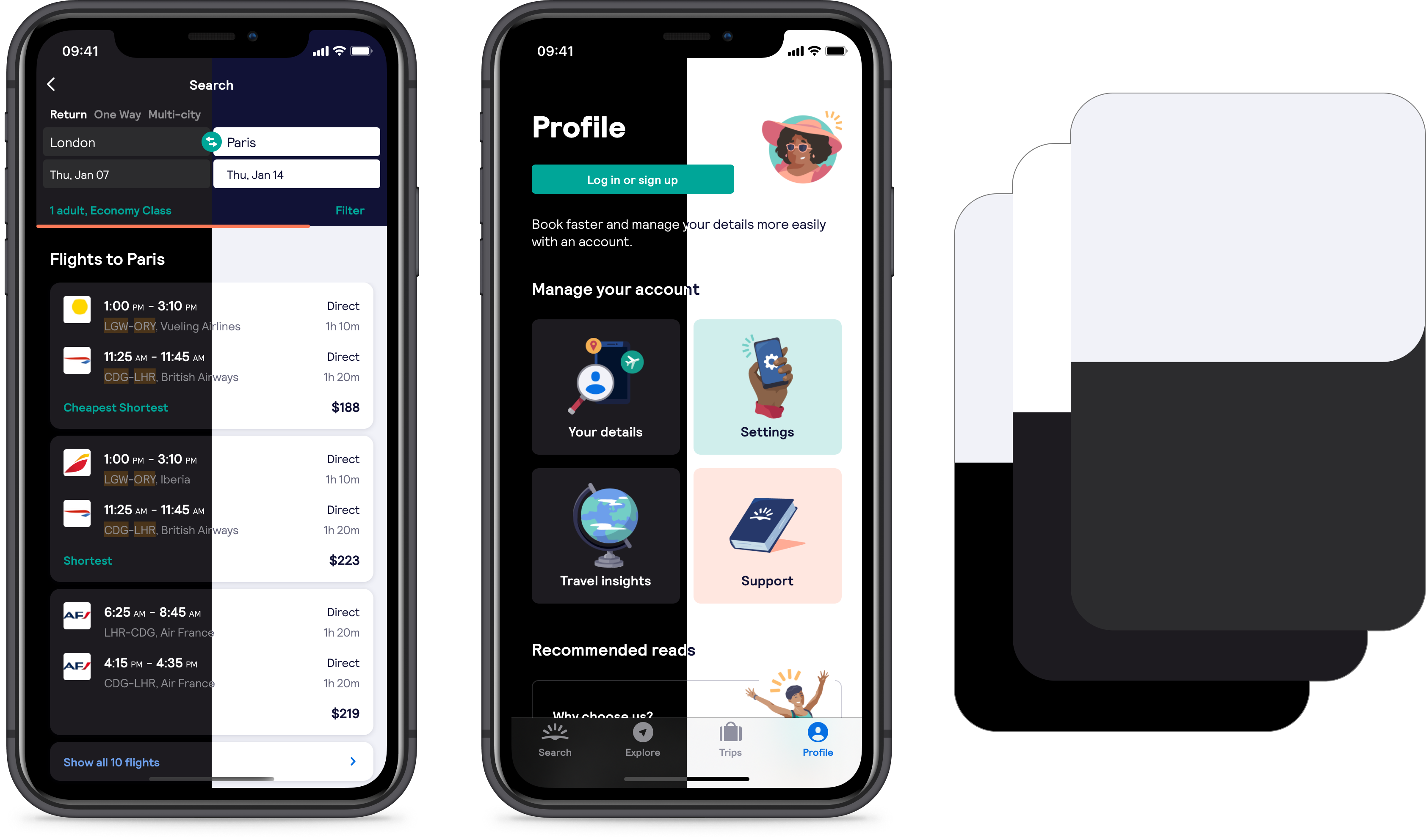
Backpack
is Skyscanner's open-source design system which supports 4 platforms (Android, iOS, React Native and Web). I spent 4 years working on the Web and native iOS offering, combining Design and Engineering in equal measures enables fast development and reduce effort duplication.

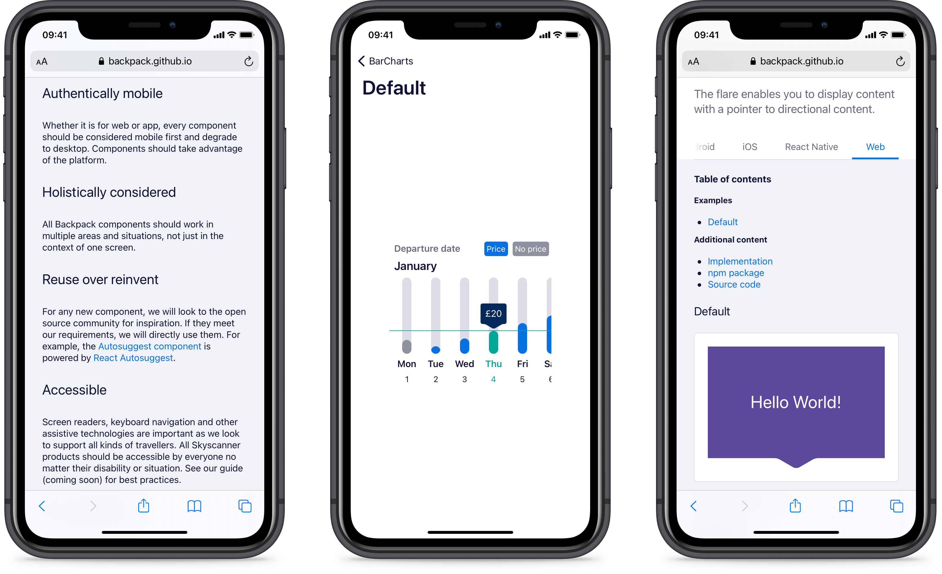
During my time at Skyscanner I led a number of technical initiatives to improve the accessibility of the design system, and worked closely with the accessibility lead to embed accessibility into our design and engineering culture.

Screenshots of Backpack accessibility documentation, the bar chart component for iOS, and the flare component for web.Screenshots of Backpack accessibility documentation, the bar chart component for iOS, and the flare component for web.

Brand refresh

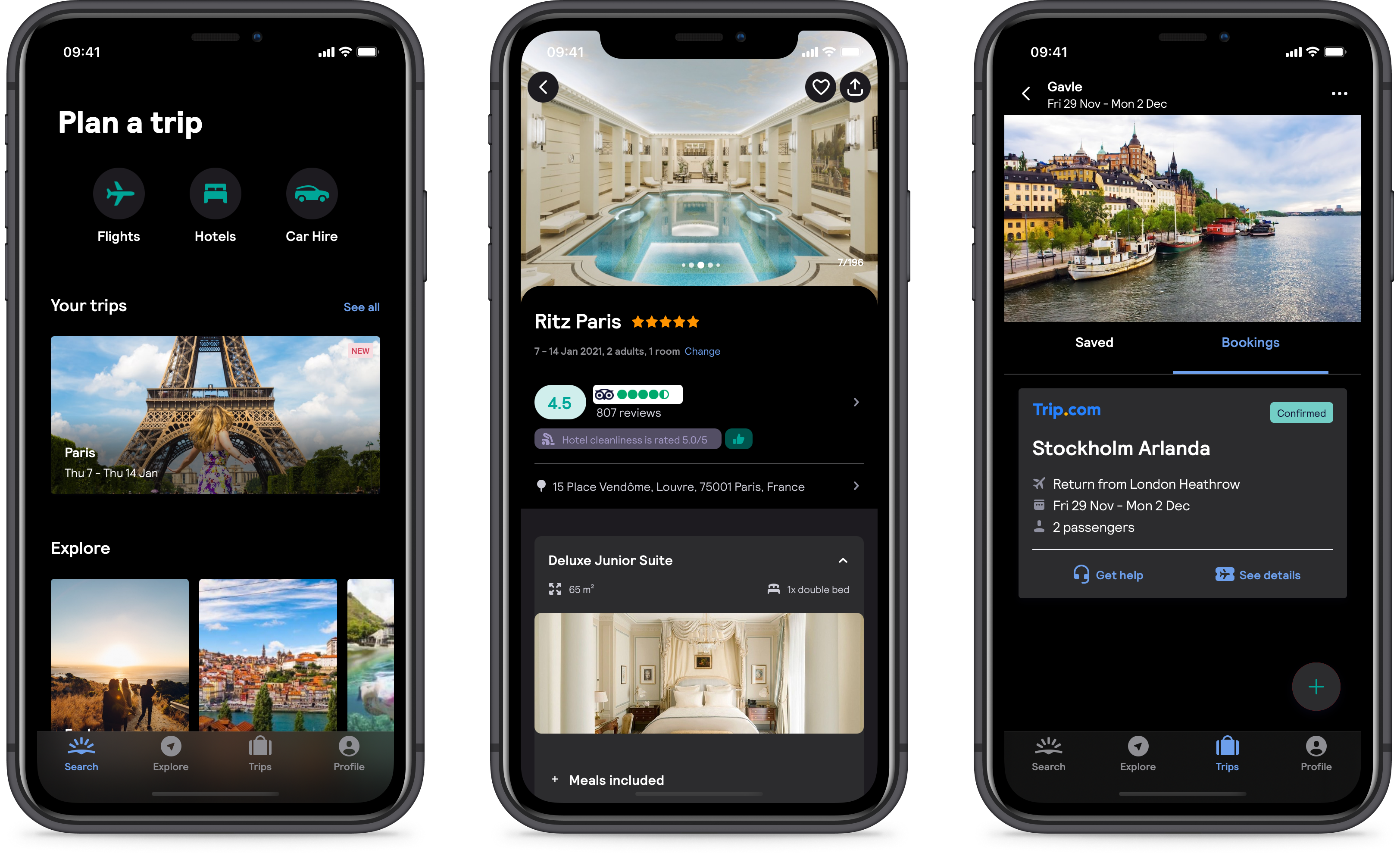
A highlight has been delivering Skyscanner’s new brand across all our products, leveraging the coverage of Backpack libraries to enable seamless experimentation and roll-out across the entire ecosystem. We made use of CSS variables for web and Appearance proxies for iOS) to allow us to swap "themes" at runtime. This allowed teams to test every part of their UI was responding to theming long before the new brand was finalised. When the new brand was signed off, we were able to easily add a new theme and control its rollout to users remotely.

A colleague wrote a great blog about how we rolled out our new brand
if you want to know more.


Screenshots of the Skyscanner app sporting the new brand.Screenshots of the Skyscanner app sporting the new brand.

Dark mode

Leveraging some of the same techniques used to deliver the new brand, we recently rolled out Dark Mode support across iOS, Android and React Native. It was great to deliver such an important traveller-first feature as quickly as we managed too, and we used the opportunity to bake accessible colour contrast into the dark-mode designs. We also redefined our elevation language for both light and dark mode while we were at it to allow us to move as quickly as possible.

Screenshots of Backpack accessibility documentation, the bar chart component for iOS, and the flare component for web.Screenshots of Backpack accessibility documentation, the bar chart component for iOS, and the flare component for web.